| Red's iPod Playlist |
|
|
| Red's Albums |
|
|
| Red Supports |
|
|
| Wednesday, May 21, 2008 |
| Corporate Website Analysis |
This assignment is late (as usual). Only received information that I needed to do the analysis earlier this afternoon. I have no idea what I'll be doing for corporate but I assume it's the last piece of shite corporation left. Hence, for this analysis I will do what I like and it is always about music. In this case, musical instruments mainly the electric guitar. I did some analysis on three different brands of guitar makers and here are the findings.
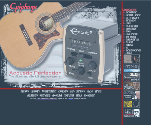
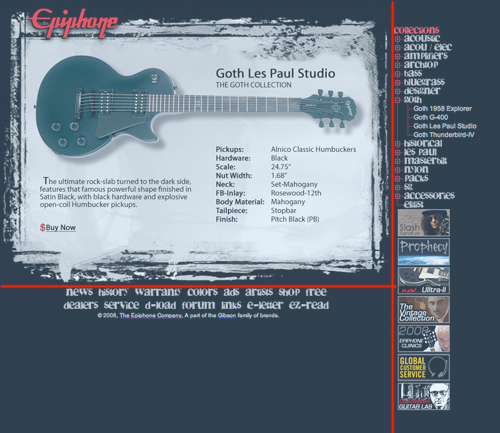
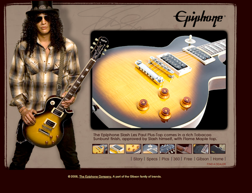
First website I'm going to review is Epiphone. For those of you who do not know, Epiphone is the sister company of Gibson Guitars. Anyway, the website is mainly aimed at promoting it's products as well as informing customers constantly with news and releases.The design for the website is simple and straight forward. The main display contains links when the product on display is clicked. It will result in a pop up window displaying information about the product. The main navigation is located on the bottom of the site. The products navigation menu is located on the right side. The products navigation resembles a drop down menu but strictly html based. There are also some GIF banners(link) below the products collection, these are mainly to promote its artist range and special releases. Clicking the banners will result in new window bringing the user to a micro site promoting the a certain range/product. In the example below, it is the Slash signature series. The micro site is completely flash based in contrast to its parent site. I find the site easy to navigate and it loads really quick. Although I'm not too impressed that the main info is stuck onto the top left of my browser window, nevertheless this is a simple design and may come off as boring.
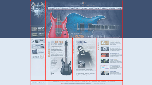
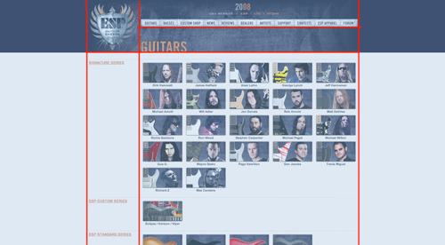
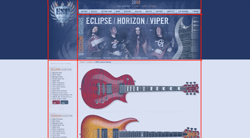
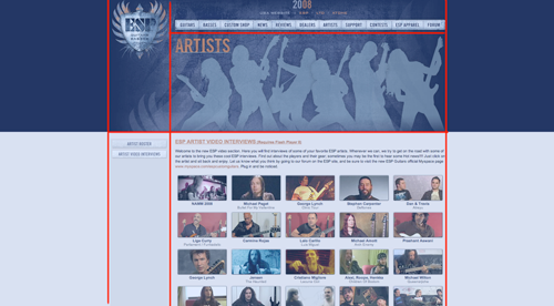
The next site I'm reviewing is ESP Guitars. The main page's grid system is well managed with the main navigation menu located at the top of the page. Below the navigation bar, is a flash application running different pictures at random; each leading the user to the designated page as it is clicked. Below this flash app is three separate columns each presenting the latest product, featured artist and latest news. The left side has small banners that will open a pop up window leading to a micro site. As one proceeds to the products page, the columns are replaced by rows with tables fitted in with pictures of artists and their signature guitars. Another row below the aritst series reveals all other ranges and series available in a similar table system. As an item is clicked, it will display the guitar on the right column as it's specifications are displayed on the left column. Note that there are also bread crumbs on just above the displayed product for users to find their way easily. I personally prefer this layout to the previous one as this looked well organised and the information well managed.
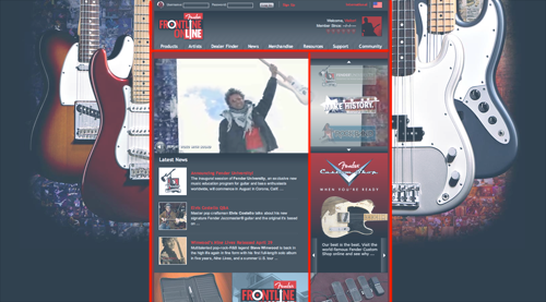
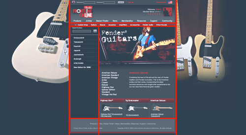
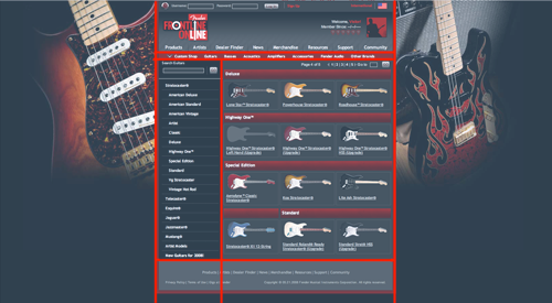
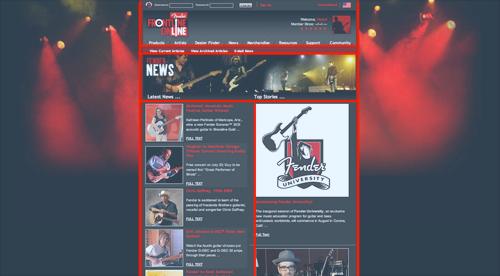
The last site I'm reviewing is none other than Fender. This is probably the most famous brand because of its reputation and popularity with many well known guitarists. At first glance, the site looks pretty impressive with its background image changing with every new page visited. The main navigation menu is also located on top of the site and below it is a flash application constantly rotating between different apps. The site has a good combination of flash and html applications. As user proceeds to the products page, it brings out a separate navigation menu below the main one, providing users the option to switch between types of guitars and other accessories. Once a type of product is chosen, user is given further options on the left column as it displays the series and ranges available. I like the fact that Fender also provides users with a search bar, allowing the user more convenience to get straight to what they want. The guitar models are displayed on the right column with all of its specifications. I think this site can be a little over the top but the navigations were the easiest and most user friendly. Especially if you know what you're looking for.
|
posted by Red @ 9:40 AM  |
|
|
|
|
| Red: Wanted! |
|

Name: Red
Home:
About:
Classified Dossier
|
| Citations |
"Whereof one cannot speak,
thereof one must be silent."
- Ludwig Wittgenstein
|
| Speaketh thy mind |
|
|
| Partners In Crime |
|
| Red Haunts |
|
| Previous Post |
|
| Archives |
|
|
 |
|