| Red's iPod Playlist |
|
|
| Red's Albums |
|
|
| Red Supports |
|
|
| Saturday, June 14, 2008 |
| Much ado about the future... |
After an interesting web design class last Thursday (courtesy of Chong/Joanne), I've been pondering about the future of Multimedia industry in Malaysia. No doubt the industry is growing and is probably has world class standards. Nevertheless, I often find it very bleak and disheartening. I don't see how this industry is going to continue growing when all that ever really happens at the beginning of every industry is a few ppl making their million and just peg out in retirement. Production houses start out trying to be different, when they realise that Malaysians don't like 'different' they switch back the industry 'standard'. Designers don't get paid enough, and mostly overworked while their bosses flaunt their new 'toy' car of the month somewhere on the Heritage Row. It sounds like a stereotypical view of the situation and many may deny this but you know that for every design house that does NOT practice this 'stereotype' there are five more out there somewhere which does. It may the reason why many experienced designers resolve to teaching as being able to do what they love and get paid equally for the amount of work they do. Am not trying to make an assumption, more of a guess. It's always about who has the most brilliant flash site or who has more kung fu in motion graphics. Make no mistake, I love motion graphics...I think it rocks the most; compared to Web, Animation and Flash(sorry Hazmer). However I've always been drawn to one area which has fuck all to do with multimedia except the putting-it-all-together-in-a-Mac part, it's album covers. Creating visuals for CD sleeves, putting visuals to music is just incredible. I've always been a sucker for album covers, probably the real reason why I actually go broke every month buying CDs. It's not always about the music, it's almost always about the excitement of unwrapping an album just to take out the sleeve and go through it inch by inch. Reading everything from lyrics to 'thank you's ; and of course browsing through whatever visuals one may find in it. It would be the ideal brief for me, making new album covers for all my favourite bands and some new ones. I find it exciting to try and listen to a piece of music and get a visual or an image in my head that represents that music. I used to illustrate how all the Radiohead albums would look like if Stanley Donwood wasn't into album covers. Of course I could always just dream. I have yet to put them into digital form as they are all just rough(and I mean very rough) sketches. I'd be fucked to be stuck in a long-hour desk job slaving away under a 'Cina-Beng' boss who probably isn't even properly qualified in the first place. If I were to be slaving, I'd rather slave under someone who has passion in what they do; not in how much authority they have over their employees. Beggars can't be choosers you cry, you're damn right. I'm not choosing; just wishful thinking. I would be stupid to think that just because one gets a job, it's something worth being grateful for. NO. Why should I be grateful to be in a position where I dread my work and be sleep deprived so that my boss gets the fucking credit. I don't know what the future holds, but one thing I know; it does NOT involve doing something against my ethical opinions. And I stand by that.
|
posted by Red @ 8:23 AM  |
|
|
|
| Wednesday, June 4, 2008 |
| Executive Summary |
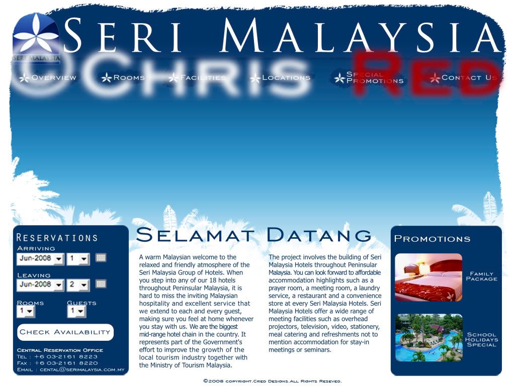
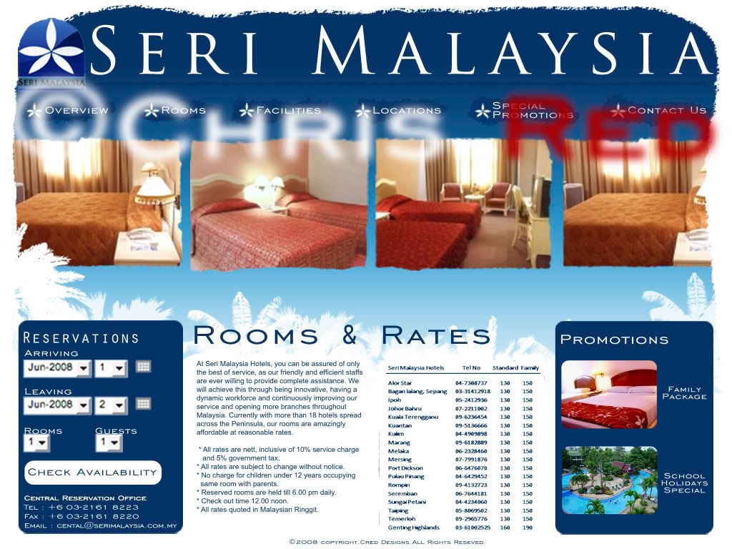
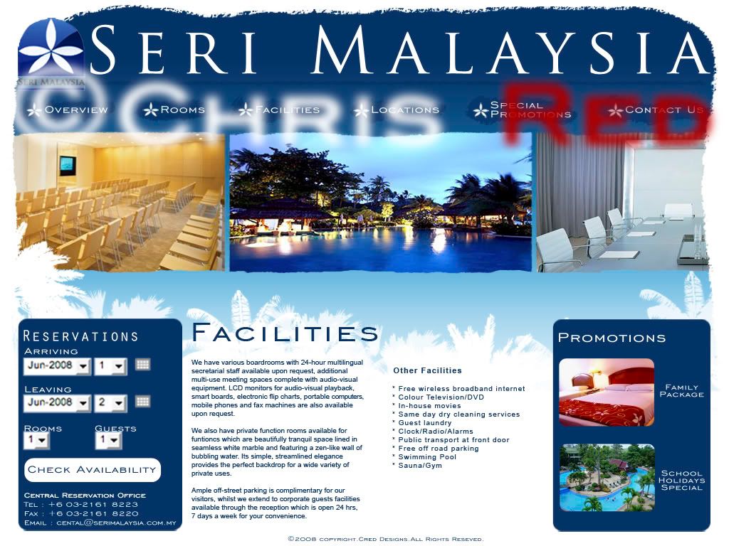
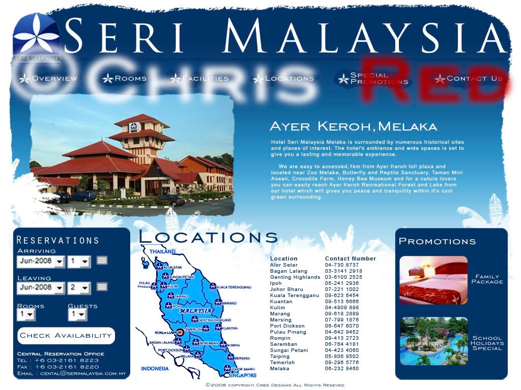
Seri Malaysia Hotels is well known for its strategic locations and also its
reasonable rates. They have not only have resorts near beaches but also hotels
near the city and in main tourist attraction areas.Their main target audience
is non other than local Malaysians travellers with family as their main focus.
However, their current website is doing them very little justice and it may
appear to many as nothing more than a budget hotel.Although the website does
get an update from time to time, the job is done very poorly with no hierachy
at all. No only is the colour scheme of the website poorly conceived, the pages
load at a snail's pace as the website seems to reload the entire page instead
of only the important updates.
The proposal is to give Seri Malaysia not only a facelift but to rebrand it
and set its target to another group of potential clients; namely foreign tourists.
Currently there may already be a small number of tourists that choose to stay
in Seri Malaysia. If they were to expand just a little bit more and include
many foreign budget travellers, not only would it increase activity within the
vicinity of the hotel but also increase tourism.
In order to accommodate this goal, the site must be revamped into something
modern but also 'Malaysian' so tourists will be able to experience Malaysian
hospitality. This would also encourage many of our local tourists who have yet
to experience it themselves. Also in addition to that, the site should also
feature an online reservation option for users interested as it will accessible
not only to local users but more importantly, foreign users.
|
| posted by Red @ 11:40 AM |
|
|
|
|
| Red: Wanted! |
|

Name: Red
Home:
About:
Classified Dossier
|
| Citations |
"Whereof one cannot speak,
thereof one must be silent."
- Ludwig Wittgenstein
|
| Speaketh thy mind |
|
|
| Partners In Crime |
|
| Red Haunts |
|
| Previous Post |
|
| Archives |
|
|
|
 |
|